Now let’s build a CSS layout that floats a sidebar so that it doesn’t have any content wrapping underneath it. We’ll start with this sample.
The container
The sample already has its first CSS selector created, which is and ID called #container. This is a common name for the rule that controls for the width of the page (and therefore, deals with the whole screen resolution/display problem). Ours is set to 980 pixels, which means it’s a fixed design. We’ve set it to 980 pixels so that it looks good on a smaller 1024px screen display, without showing the chrome. If you use the full 1024px, the scroll bar will appear, even though it’s not really needed.
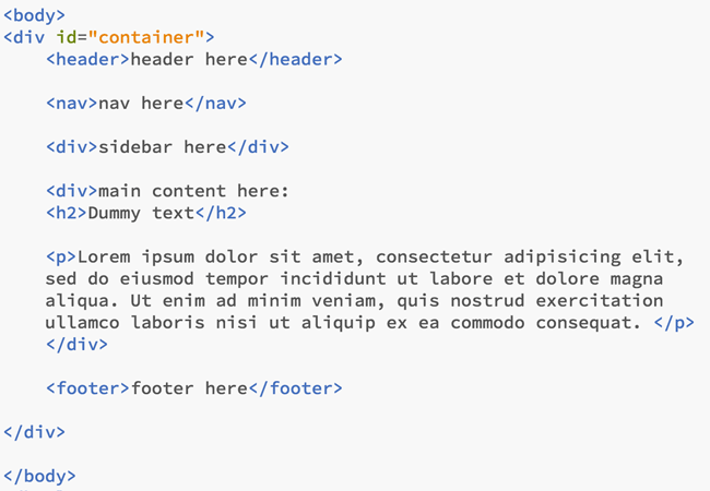
Inside the container, we’re going to include a few more div tags and their corresponding semantic tags.
Semantic tags to use with styling, and those to use without
This is an area of some debate still, but I’d say the best practice is to use these semantic tags for styling (i.e., you can use the tag as a selector)
- header
- footer
- nav
I would just use the rest of them (for now) as semantic tags that will go within the blocks of your design. So that means the rest of your design will sit in <div> tags.
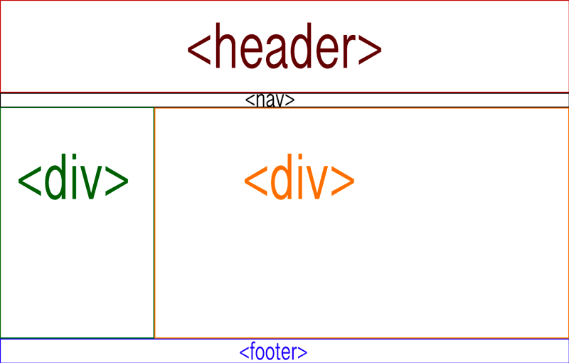
So, think about the shape of your design, and add your tags accordingly. We’re going to create a fairly simple layout that includes, a header, footer, navigation bar, and two columns — one for the sidebar and one for the main content.
Add the tags
So let’s add these tags into the page we downloaded. When you’re done, the code inside your body tags should look like this:
We’ll skip the next step, which would be to put the other semantic tags in where they should be, as you might want to add those as you add your content.
Now, let’s style this puppy!
Okay, now that we have the HTML written, we can put in our styles and connect them in the HTML when we’re done. We’ll add the following styles to the style sheet:
header {background-color:#333;

border-bottom: 1px solid #000;}
nav {padding-left:220px;

border-bottom: 1px solid #000;}
#sidebar {float:left; padding:10px;

width:200px; background-color:#333;}
#content {margin-left:250px; margin-right:15px;}
footer {background-color:#333; padding-left:220px;

padding-right:15px; clear:left;}
The last thing you’ll need to do is to add the ID attributes to the div tags. The first div tag after the nav takes the sidebar ID and the second takes the content ID:
<div id="sidebar">
<div id="content">
Check this out on a finished page here.
How does this work?
Understanding the CSS is important. Most of the CSS is self-explanatory at this point. (Background colors, borders, and padding.) What may be confusing is the floats, the margin and the clear:both command.
You’ll see that in this layout, the only div that has a width and a float is the sidebar. That’s because the content div will inherit values from the parent elements above it (the body and container div). With the sidebar floating to the left, everything that comes after it will wrap to the right. That means the browser will look at the horizontal space available from the parent (the container, which is 980px) and go from there.
It will subtract the width of the sidebar (200px + 20px padding=220px). That leaves 660px of width for the content. We’ve also added a bit more margin on the left and right side: (250px-220px=30px and 15px, which add to 45px), so the final width of the content area will be 660px-45px=615px. That big margin on the left side of the content area also helps create the illusion of a consistent column on the left.
Finally, the clear. This is the property in the footer. The problem with floats is that they are inherited by everything that comes after it. That his helpful for the content div, but a problem for the footer, because we don’t want it to wrap around the sidebar. We fix this by telling the browser to stop all the floating with the clear property.
Making a 3-column layout this way
Adding a third column is quite easy. Simply add a new div after the sidebar div. Let’s give it this ID:
<div id="rightside"></div>
Now, in the CSS, we’ll add the new ID:
#rightside {float:right; width: 100px;

padding:10px; background-color: #ddd;}
In the content ID we need to increase the margin on the right side, so there’s room for this new sidebar.
Have a quick look at this in the browser and you’ll see the content div is just wrapping around the new right sidebar. That’s because we need to increase the margin on the right side of the content to allow for the new div.
Time for more math! The new rightside ID has a width of 100px, and padding of 10px so, 100+10×2=120px. We’ll want to leave a bit of a gutter between the new columns, so make the margin on the right side of the content ID 150px.
#content {margin-left:250px; margin-right:150px;}
Now have another look. Seems fine, but just to be on the safe side, we should also make sure we clear the new right float. Do that in the footer tag CSS, by replacing the word “left” with “both”. That will clear both the right and left floats.
footer {background-color:#333; padding-left:220px;

padding-right:15px; clear:both;}
Now you’ve created your first CSS layouts!